
Editorial web design for boutique luxury hotels and travel brands: moving beyond template sites
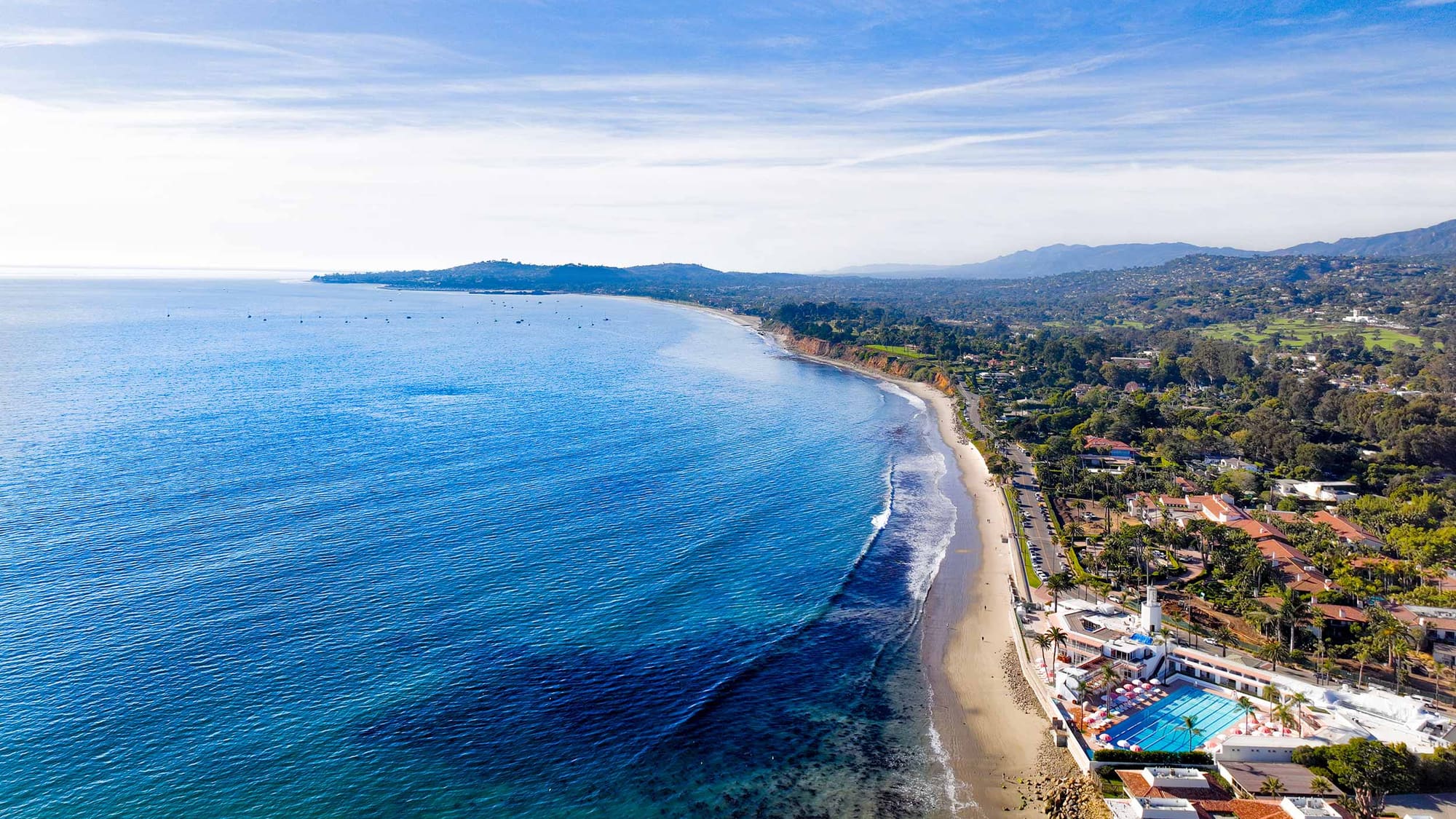
A guest choosing between two $900-a-night properties is deciding which one feels like the trip they want, and the website makes that argument first. Editorial design borrows from print: one strong image at a time, generous space, confident type, short captions, and a clear point of view. Paired with a calm direct booking path, restraint sells.
A guest deciding between two $900-a-night properties is not comparing amenities lists. They are deciding which one feels like the trip they want. Your website makes that argument before your front desk ever gets the chance. A template site with a stock slider, six fonts, and a "Book Now" pop-up makes the wrong argument: that you are like everyone else.
Editorial design makes the right one. It borrows from print magazines: one strong image at a time, generous white space, confident typography, short captions, and a clear point of view. Think of the calm of Aman's site or the pacing of a Virtuoso magazine spread. The restraint is the message.
Why does restraint sell high-ticket travel?
Luxury is partly the absence of noise. A guest paying for privacy, quiet, and attention is sensitive to the opposite. When a site shouts (banners, countdown timers, five competing buttons), it signals a property that will also shout.
Three design choices do most of the work:
White space. Space around an image or a line of text tells the eye it matters. It also slows the reader down, which is what you want when the product is an unhurried stay.
High contrast, limited palette. Near-black type on a warm white ground, one accent color, and photography supplying the rest. A small palette makes the property's own colors (stone, linen, ocean) the brand.
Typography with a voice. One serif with character for headlines, one quiet sans for details. Type set large and left to breathe reads like a publication, not a brochure.
None of this is decoration. It reduces the number of decisions a visitor has to make, and fewer decisions is what moves someone toward a booking.
What does "editorial" mean in practice?
| Template site | Editorial site |
|---|---|
| Auto-rotating hero slider | One full-bleed image or a short, silent film |
| "Welcome to our hotel" | A headline with a point of view |
| Grid of amenity icons | A story about one morning at the property |
| Room list with thumbnails | Each room as a feature, with a floor plan and the view |
| Stock photography | Commissioned images with a consistent grade |
| Pop-up booking prompt | A persistent, quiet "Check availability" |
| Blog as an afterthought | A journal that reads like a magazine |
The structure follows a magazine feature: a cover, a lead, sections with their own pacing, and captions that add something the image can't. For a boutique hotel in Montecito or Los Olivos, that might be the arrival, the rooms, the table, the grounds, and the neighborhood, each given a full screen.
Where do template sites fail luxury brands?
- Sameness. Remove the logo from most hotel sites and you can't tell which property it is. Boutique hotels compete on character. The site has to show it.
- Widget clutter. Chat bubbles, review badges, newsletter pop-ups, and cookie banners stacked on a phone screen.
- The booking handoff. The guest clicks Reserve and lands on a third-party page with different fonts, a different URL, and a dense rate table. The spell breaks at the exact moment of commitment.
- Weight. Template code plus uncompressed photography equals a slow first load, which is when the impression is formed.
- Invisible facts. Rates, room details, and policies trapped in the booking engine where search engines and AI assistants can't read them.
How does design connect to direct bookings?
This is where aesthetics become revenue. Guides for independent properties put OTA commissions at 15 to 30 percent of each booking (opens in a new tab), and note that many travelers who discover a hotel on an OTA visit the hotel's own website before they book. A 2026 direct-booking analysis from Prostay (opens in a new tab) argues that the core problem for independents is that their own sites convert at a fraction of the OTA's rate.
So the editorial front end needs a commercial spine:
- A calm, persistent booking bar. Dates, guests, check availability. Always present, never shouting.
- A branded booking flow. Same typography and palette through to confirmation.
- A reason to book direct. Best rate, a welcome amenity, flexible cancellation, or early check-in. State it once, plainly.
- Rooms as landing pages. Each with its own URL, images, dimensions, view, and starting rate in text.
- Speed. Art-directed images served in modern formats at the right size. Editorial sites can be fast. They have fewer moving parts.
What about travel advisors and experience brands?
The same logic applies with a different conversion. An advisor is not selling a room. They are selling judgment. An editorial site shows that judgment through curation: fewer destinations presented with a real opinion, a journal with first-hand notes, and an inquiry form that feels like the start of a conversation.
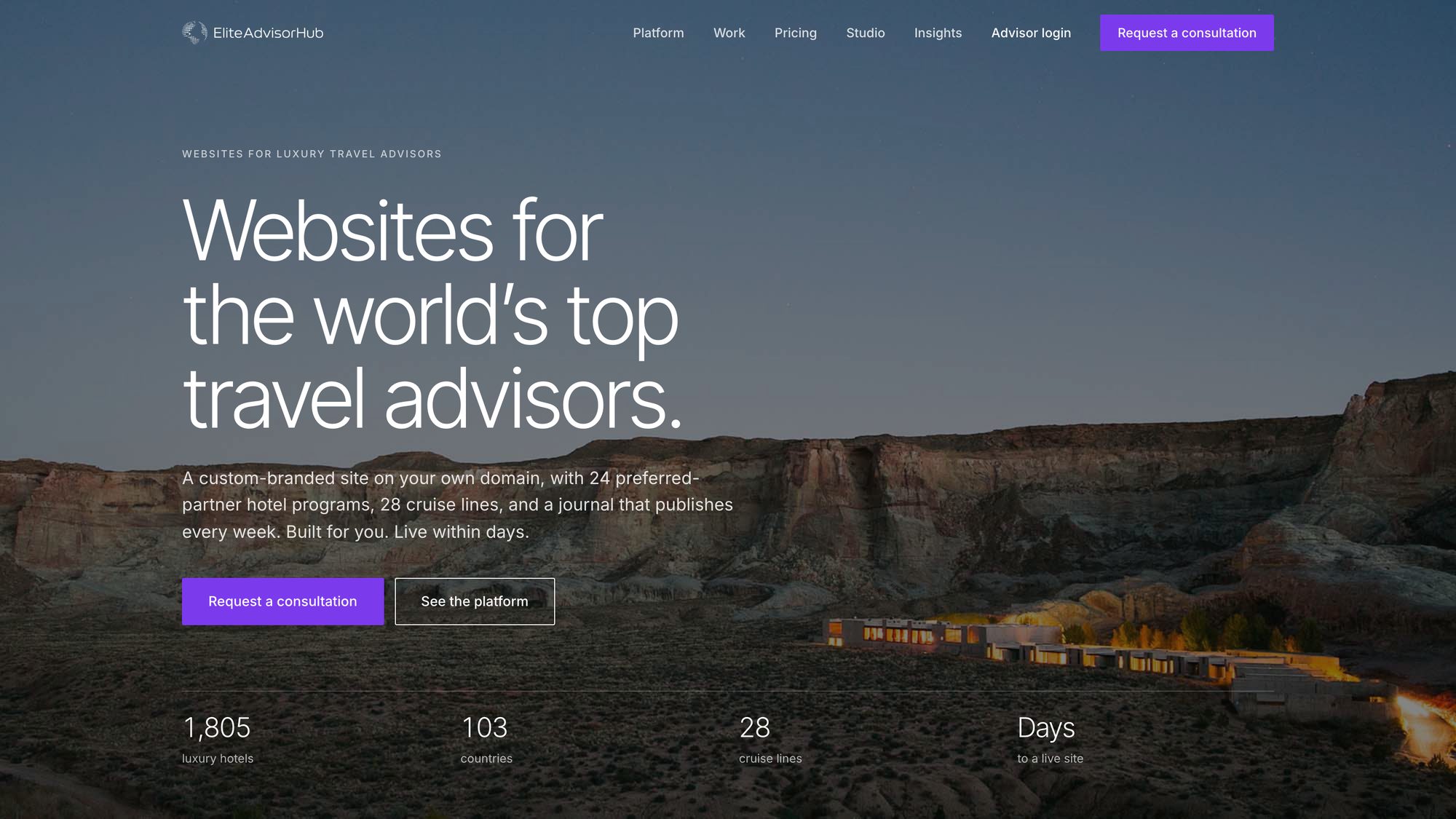
That thinking is behind Elite Advisor Hub (opens in a new tab), the platform I built for luxury travel advisors. Advisors get editorial templates or a custom build on their own domain, with a journal, preferred-partner hotel and cruise catalogs, and a lead inbox behind it.
For experience operators, SB Boat Charters (opens in a new tab) shows the same approach at a smaller scale: photography and film first, trips presented as features, and a booking engine built into the site so the design never hands off to a third-party page.
And Sunstone California (opens in a new tab) is the brand-led version for an estate winery, villa, and beverage line, where the store and the story share one visual language.
How do you keep it findable?
Minimal on the surface does not mean thin underneath. Every editorial page should carry:
- Real text for location, room types, rates from, policies, and dining hours.
- Hotel, room, and FAQ structured data.
- Descriptive alt text on photography.
- A neighborhood guide written in your own voice, which is exactly the kind of content AI assistants quote when someone asks where to stay in Santa Barbara wine country.
This is where design meets SEO, AEO, and GEO. The front end persuades people. The structure underneath persuades machines.
A short brief you can hand a designer
- One typeface family for headlines, one for text. No more.
- A palette of three colors plus photography.
- No sliders, no pop-ups on arrival, no autoplay sound.
- Every room and every experience gets its own page.
- Booking stays on brand through confirmation.
- Mobile first. Design the phone screens before the desktop ones.
- Largest image under a few hundred kilobytes.
- All facts in text, with structured data.
Where to start
Open your site next to two properties you admire. Cover the logos. Ask whether a stranger could tell which one is yours, and how many taps it takes to see a rate. If the answers are "no" and "too many," the template is costing you bookings.
I design and build editorial websites for boutique hotels, wineries, and travel brands on the Central Coast, with booking and search structure built in. Request a quote here.
Sources
Common questions
Is minimalist design bad for SEO?
No. Search engines read text and structure, not decoration. A minimal page with clear headings, real copy, and structured data can outrank a busy one.
Do boutique hotels need a custom site, or is a template enough?
A template is fine for a new property testing the market. Once your rate and reputation are established, a site that looks like everyone else's undersells you.
How do I get guests to book direct instead of through an OTA?
Make your site the better experience: faster, clearer, on brand through checkout, with a stated benefit for booking direct. Keep OTAs for discovery.
How much photography do I need?
Fewer, better images. Fifteen to twenty commissioned photographs with a consistent look outperform a gallery of two hundred.
How long does an editorial site take to build?
For a single boutique property, typically a few weeks once photography and copy are ready. Content, not code, is usually what sets the timeline.
Related posts
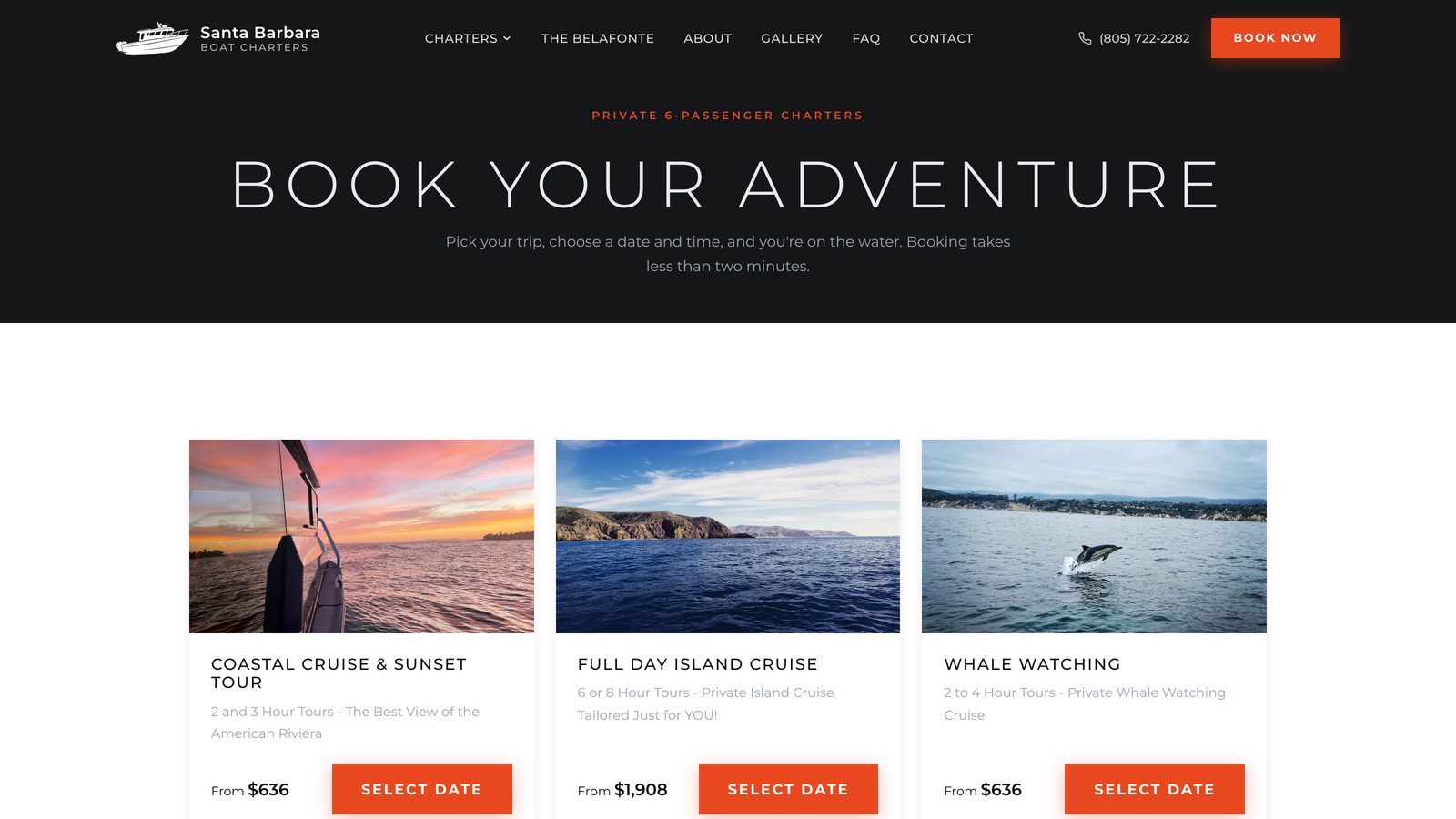
Why your charter booking engine is losing bookings at checkout
Seven friction points that make guests abandon a charter or tour booking, what each one costs, and why a custom booking engine converts better.
How independent luxury travel advisors can use AI to scale client communication without losing the personal touch
Where agentic AI helps independent luxury travel advisors with inquiries and itinerary drafts, where a human stays in the loop, and how to set it up.